


Pix Material Expressive Icons
4.487.00 Reviews
App Specs
- Version
- 11.9.5.Build
- Updated On
- License
- $1.99
- Downloads
- 10,000+
- Developer
- PashaPuma Design
- Categories
- Personalization
- Platform
- Android
Screenshots
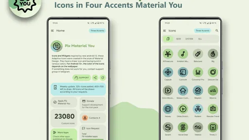
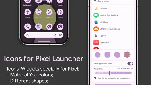
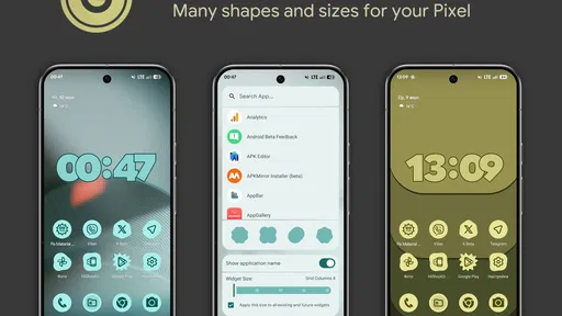
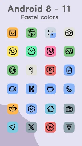
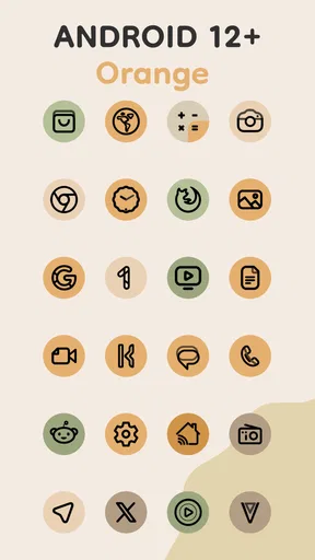
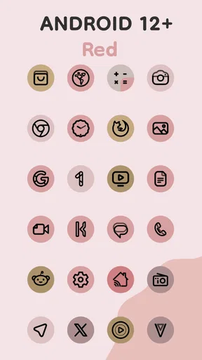
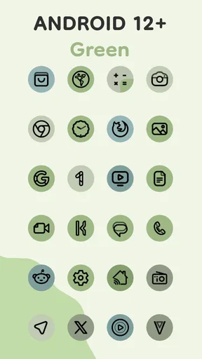
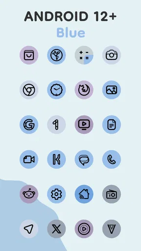
 Analysis by AppCompare
I approached Pix Material Expressive Icons as a practical personalization tool rather than something to install and forget. Its purpose is simple: give an Android home screen a more consistent visual identity through adaptive icon artwork influenced by Material You and enhanced Monet colors. That sounds like a small change, but icons are among the first things I see every time I unlock my phone, so the right pack can make the whole interface feel calmer and more intentional.
This is a paid icon app from PashaPuma Design, listed in the personalization category. It has an average rating of 4.4 from around 1.1 thousand ratings, with more than 10 thousand installs. Those figures suggest a focused audience rather than a mass-market utility, which matches my experience: this is aimed at people who care about the details of their launcher, wallpaper, widgets, and color palette.
The important question is not simply whether the icons look attractive. It is whether they fit the way you use your phone, whether your launcher handles them comfortably, and whether changing your current setup is worth the effort. I found the strongest case for this pack among users who already enjoy customizing Android. For someone who wants a quick, automatic visual refresh with no interest in launchers or icon management, a built-in phone theme may be the better route.
How I judged the icon pack before recommending it
I judged an icon pack by more than its first attractive screen: I wanted to know whether the visual change would still feel useful once the novelty wore off. I’ll explain the practical checks I used, including how launcher support and everyday app recognition affect the decision, before turning to the situations where this pack makes the clearest case.
Visual consistency matters more than a few impressive icons
When I assess an icon pack, I look beyond individual designs. A handful of attractive icons is easy to achieve; the difficult part is making a full home screen look coherent when the apps come from different companies and use completely different branding. Pix Material Expressive Icons works best when I judge it as a system. The Material-inspired shapes and adaptive approach are intended to bring unrelated applications into the same visual family, so the result depends on how many of your everyday apps are represented and how your launcher renders them.
I also pay attention to how the icons interact with the wallpaper. The appeal here is not just bright color. The Material You direction makes the palette feel connected to the rest of the Android interface, while the enhanced Monet coloring gives the pack a more expressive appearance than a strictly neutral set. If your wallpaper has a strong color identity, this approach can make the home screen feel deliberately assembled instead of decorated with unrelated logos.
My advice is to judge the pack with your actual wallpaper and most-used apps in mind. An icon that looks excellent in a store preview may feel too vivid beside a muted background, while a colorful home screen can benefit from the extra character. The same visual strength can therefore be a benefit or a distraction depending on your taste.
Worth Reading Before You Choose

EA SPORTS FC Mobile 26 Is a Bigger Football Game, but It Takes Time
Flipboard Shows What News Apps Must Do Beyond the Feed

Switching to Android Auto Means Rethinking Your Driving Routine

Google Calendar Makes a Crowded Week Easier to Manage

Ludo King Makes the Most of the Minutes Between Plans

Baby Panda World Brings Quick Play to Modern Phones, but Its Game Library Feels Busy
Launcher compatibility should be part of the decision
Icon packs are not completely independent of the launcher. The launcher is responsible for applying the artwork, presenting adaptive shapes, and handling icons that do not receive a direct replacement. That means I would not treat a good-looking pack as a guaranteed universal solution. Before changing a carefully arranged home screen, I would check whether my current launcher supports third-party icon packs and whether it exposes the controls needed to apply them.
This is also where the difference between a dedicated icon pack and a phone’s built-in theming system becomes clear. A system theme is usually more convenient because it is already integrated with the device. A third-party pack asks for a little more involvement, but it can offer a more deliberate visual direction. If you enjoy choosing a launcher, arranging folders, and tuning icon size, that extra control is part of the value. If you want the phone to make every decision for you, it can feel like unnecessary friction.
What I look for in daily use
I do not only test an icon pack on the first screen. I move through folders, search for less-used applications, open the app drawer, and look at the notification shade and widgets beside the icons. This matters because a home screen can look polished while folders remain visually uneven. I also check whether the icon shapes make familiar apps easy to recognize at a glance. A more unified design is useful only if it does not slow me down.
For this pack, the most interesting trade-off is between recognition and harmony. Original app logos often provide instant recognition because I have learned their colors and shapes. A themed icon can look cleaner, but it may remove some of those visual shortcuts. I found that this is less of a problem for frequently used apps, because muscle memory takes over, but it can matter for applications I open only occasionally.
Where Pix Material Expressive Icons makes the strongest case
The strongest argument is not simply that the icons look coordinated; it is that their adaptive shapes and expressive color can make a familiar Android layout feel considered without rebuilding it from scratch. I’ll look at where that payoff recurs in ordinary use, and where a quieter built-in theme or more hands-on launcher may suit you better.
It gives Material You styling a more intentional finish
The main strength is the way the pack aims to connect icon design with the broader Material You language. Instead of treating each icon as an isolated badge, it provides a visual layer that can sit naturally beside Android’s color-driven interface. The enhanced Monet colors are especially useful when I want the home screen to echo the wallpaper without manually recoloring every element.
This is more convincing than simply placing a random collection of colorful icons on the screen. When the wallpaper, widgets, and icons share a related tone, the phone feels more composed. I would recommend trying a simple layout first: one main row of frequently used apps, a small number of folders, and enough empty space for the colors to breathe. Packing every available shortcut onto the screen can hide the design work that makes this icon style worthwhile.
Adaptive shapes can reduce the visual noise of mixed app branding
Android applications are not designed as a single visual system. Some use circles, some use squares, and others rely on unusual logos or text. Adaptive icons help bring those differences into a common framework. That is valuable to me because the home screen is easier to scan when the icons occupy similar visual space.
The benefit is most noticeable on a minimalist setup. With a restrained wallpaper and a small set of shortcuts, consistent shapes make the entire screen feel less busy. On a crowded screen, the effect is still present, but it competes with widgets, badges, folder labels, and multiple rows of icons. In other words, the pack can improve the visual foundation, but it cannot replace good screen organization.
It suits people who want expressive personalization without drawing every icon themselves
There is a useful middle ground between accepting the default icons and building a completely bespoke theme. Pix Material Expressive Icons occupies that middle ground. I can change the personality of the phone quickly while keeping the familiar structure of my launcher. That makes it appealing for someone who wants a noticeable refresh without redesigning every part of the interface.
A realistic example is a phone used for both work and personal life. I might use a subdued wallpaper during the week, keep communication and productivity apps on the first page, and place entertainment apps in folders. A coordinated icon pack makes that arrangement feel more professional without forcing me to abandon the apps or launcher I already know. When I change the wallpaper later, the Monet-inspired color relationship can help the setup feel refreshed without starting over.
There is a practical advantage in using a dedicated pack
A dedicated icon pack gives me a repeatable way to change the appearance of the phone. Instead of manually editing individual shortcuts, I can treat the icon style as part of the overall setup. That is useful when experimenting with different wallpapers or launcher layouts. I can make a broad visual change first, then decide whether a few individual shortcuts need extra attention.
My most useful workflow was to apply the pack before adjusting the layout. If I rearrange the screen first and theme it afterward, the new visual weight of the icons can make the spacing feel wrong. Applying the icon style early lets me judge folder placement, widget size, and empty space as one composition. This is a small step, but it avoids repeatedly rebuilding the same home screen.
Small details make it attractive to customization enthusiasts
The store summary emphasizes vibrant adaptive icons, Material You styling, and enhanced Monet colors. In practice, that combination is appealing because it addresses three separate concerns: shape consistency, Android visual language, and color expression. I would not describe it as a universal replacement for every icon style, but it has a clear point of view.
That point of view is also why the pack may appeal more to enthusiasts than casual users. If I already notice whether a widget clashes with my wallpaper, I will understand the value immediately. If I barely look at the home screen and open applications through search, the visual improvement may not justify paying for another personalization tool.
What happens when an app does not match the theme
No icon pack can make an entire phone feel perfectly uniform if some applications remain outside the chosen style. The practical issue is not only whether an icon is included; it is how the unmatched icon looks beside the themed ones. I would therefore organize the first screen around the applications that look best together and move visually inconsistent shortcuts into folders or a secondary page.
This is a genuinely useful compromise. It keeps the most visible area cohesive without requiring me to give up applications I need. It also makes the pack feel more successful because the eye naturally focuses on the coordinated group. For a mixed app collection, careful placement can matter almost as much as the artwork itself.
How the price changes the value calculation
The app costs $1.99, which places it in the range of a small, deliberate customization purchase rather than a free experiment. There are also in-app purchases priced from $0.99 to $9.99 per item. Because of that combination, I would review the purchase screen carefully before committing to additional content or options. The central question is whether the main pack already gives me the visual change I want.
I think the price is easier to justify for someone who keeps a customized home screen for months. If I change launchers and themes every few days, the purchase may feel less worthwhile because I am paying for a style I may quickly replace. The app is also marked for Everyone, and it requires Android 8.0 or later, so compatibility is broad among supported Android devices, though the launcher remains an important practical consideration.
What the current release tells me about upkeep
The current version is 11.9.5.Build, and the app was released on September 5, 2021. I would treat that history as a reason to check the present behavior on my own device rather than assuming every launcher will behave identically. Icon packs depend on Android versions, launcher implementations, and the way individual applications expose their icons, so installation is only the first part of the experience.
My recommendation is to take a screenshot of the existing home screen before applying the pack. That gives me a reference for icon placement, folders, and widgets if I decide to reverse the change. I would also apply the pack when I have a few minutes available, not immediately before leaving home or starting work. The change is simple in concept, but launcher settings can turn a quick visual refresh into a small organization project.
Who should choose a different kind of solution
I would skip this pack if my priority is absolute convenience. A built-in device theme or launcher with integrated icon styling is usually easier for people who want one switch and no further adjustment. I would also hesitate if I rely heavily on several niche applications and want every shortcut to share the same treatment. In that situation, a launcher with strong manual icon editing may offer better control, even if the result takes longer to create.
It may also be the wrong fit for someone who prefers plain monochrome icons, highly realistic artwork, or a deliberately retro appearance. The expressive Material You direction is specific, and its strengths are not universal. Choosing it because adaptive icons are fashionable, while disliking colorful personalization, would lead to disappointment.
Switching from another icon pack
The cost of switching is not only the purchase. I also have to reconsider the balance of my home screen. A different icon shape can make rows appear tighter or looser, and a stronger palette can change how much visual space a widget seems to occupy. If I am moving from a subdued pack, the new colors may make the wallpaper feel too busy. If I am moving from a highly detailed pack, the Material-inspired simplicity may initially seem less distinctive.
I would switch in stages. First, I would save the old arrangement. Next, I would apply the new icons without changing the wallpaper. Then I would evaluate the first page, folders, and app drawer separately. Only after that would I alter the wallpaper or widgets. This process makes it easier to identify whether I like the icons themselves or merely like the novelty of a complete redesign.
One advanced but practical tip is to keep a small “utility” folder for unmatched applications instead of scattering them across the main screen. This protects the cleanest visual area while preserving access to everything. Another is to use the most expressive colors sparingly: a colorful wallpaper and colorful widgets can overwhelm the icons, whereas a quieter background lets the adaptive treatment become the focal point.
My recommendation for different Android users
I recommend Pix Material Expressive Icons to Android users who enjoy a coordinated home screen and want a stronger connection between their wallpaper colors and app icons. It is particularly suitable for someone who already uses a launcher that supports icon packs and is willing to spend a little time arranging the result. The combination of adaptive shapes and Monet-inspired color makes it more purposeful than a random collection of redesigned logos.
I would recommend caution for users who expect every application to transform perfectly with no setup. The experience depends on the launcher, the organization of the home screen, and how much visual consistency matters to you. A free built-in theme is the better choice when convenience is the main goal. A manually editable launcher is better when you need precise control over individual icons. This pack is strongest in the middle: more expressive than default Android, but simpler than creating a complete custom system.
After using it, my view is that the app earns consideration because it has a clear design direction rather than trying to suit every taste. The $1.99 entry price is reasonable for a personalization purchase I expect to keep, but the extra in-app purchase range means I would avoid buying add-ons impulsively. I would first apply the core style, test it with my real wallpaper and launcher, and decide whether the visual change remains enjoyable after the first day.
My clear recommendation: choose it if your ideal Android setup is colorful, coordinated, and influenced by Material You, especially when you enjoy fine-tuning the home screen. Skip it if you want a completely automatic theme, dislike expressive color, or do not want to spend time resolving the occasional mismatch. For the right user, it turns ordinary app shortcuts into a more unified part of the phone’s design; for everyone else, the built-in alternative may be the smarter and simpler answer.
Pros
- Bright
- expressive icon designs add personality to home screens.
- Large icon collection supports many popular apps.
- Consistent visual style creates a polished
- unified setup.
- Works well with custom launchers and themed wallpapers.
- Frequent updates can improve coverage and maintain compatibility.
Cons
- Some app icons may use generic alternatives when unsupported.
- Full access to every icon may require an in-app purchase.
- The colorful style may not suit minimalist home-screen setups.
- Applying icons can require extra launcher configuration on some devices.
- Icon rendering may vary between launchers and Android versions.
FAQs for Pix Material Expressive Icons
What is Pix Material Expressive Icons?
Pix Material Expressive Icons is an Android icon pack designed to give compatible launchers a modern, Pixel-inspired appearance. It replaces standard app icons with a consistent visual style featuring expressive shapes, refined colors, and carefully designed alternatives. The pack is intended for users who want to personalize their home screen without installing a completely different launcher or changing the phone’s operating system.
Which devices and launchers are compatible with Pix Material Expressive Icons?
Compatibility depends mainly on your Android version and the launcher installed on your phone. Pix Material Expressive Icons generally works with popular third-party launchers that support icon packs, such as Nova Launcher, Lawnchair, Smart Launcher, and similar alternatives. Some manufacturer launchers may not allow external icon packs, so checking your launcher’s customization settings before downloading is recommended.
How do I apply Pix Material Expressive Icons after installing it?
After installation, open the icon pack or go to your launcher’s appearance settings and look for the icon-pack section. Select Pix Material Expressive Icons, then apply the changes to your home screen and app drawer. The exact steps vary between launchers. If an icon is not automatically changed, you may be able to replace it manually using the launcher’s individual icon-editing option.
Does Pix Material Expressive Icons include icons for every application?
No icon pack can guarantee coverage for every application, especially newly released, regional, or less popular apps. Pix Material Expressive Icons may include a broad selection of commonly used icons, while unsupported apps can remain unchanged or use a themed generic icon, depending on the launcher. Users should also check whether the pack receives regular updates for additional icons and fixes.
Is Pix Material Expressive Icons free, and does it affect phone performance?
The availability and pricing of Pix Material Expressive Icons can vary depending on the store listing and version, so users should review the current download page before installing. As an icon pack, it normally has a limited effect on performance because it mainly supplies image assets to the launcher. However, older devices may experience minor launcher delays if using very large icon packs or heavy customization settings.


